Blood Brothers 2 – Home Screen
category: UI/UX Design
Blood Brothers 2 – Home Screen
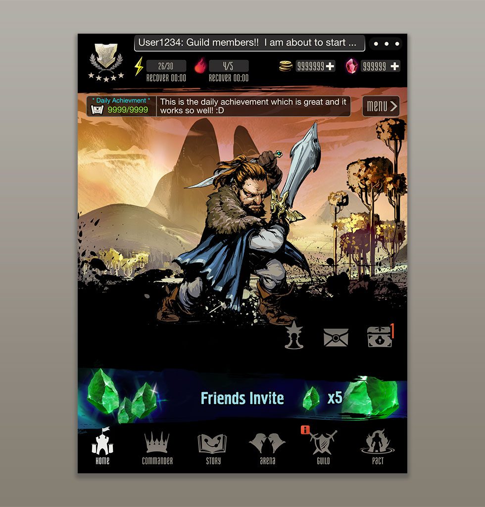
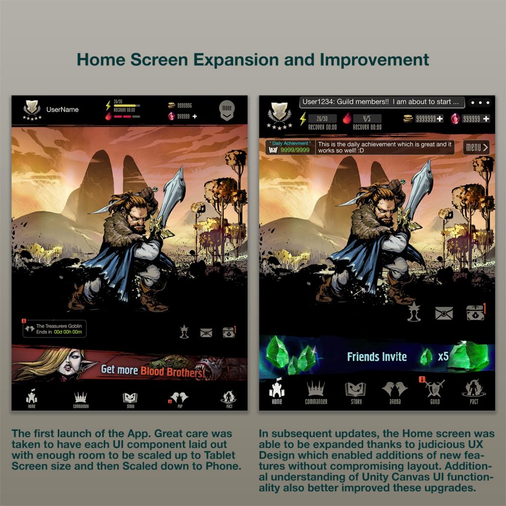
The BB2 Home Screen is the primary landing scene for a user when starting up the application after having completed the First-Time-User-Experience tutorials. It is from here that the user can access the whole breadth of features and flows of play. The interface needed to therefore contain a wealth of information and navigable buttons, but it also had to be presented in an intuitive and organized way to allow the user to associate screen location with those components.
The primary navigation would be achieved through the Footer component, containing all the buttons that would take the user to the main screens of the app The Header component would be reserved for information regarding the user's own profile, including their current In-App-Currencies and Energy (used to perform functions in the game), in addition to app Settings.
The central image of the page was decided to be an image carousel of the user's own acquired characters in the game, . This was intended to give a sense of accomplishment and pride in their purchases through the "Gacha" RNG system. The Background image and the animated character sprite would fade in and out as the carousel looped. User could even Tap the image to go to that Character's Detail Screen.
As event advertising/marketing banners were also a requirement, a space was reserved for that just above the Footer, which would also be an image carousel that would loop the various ongoing sales and marketing promotions that were going on. Auxiliary features such as News, Gifts and Achievements would also be positioned in the vicinity of this component.
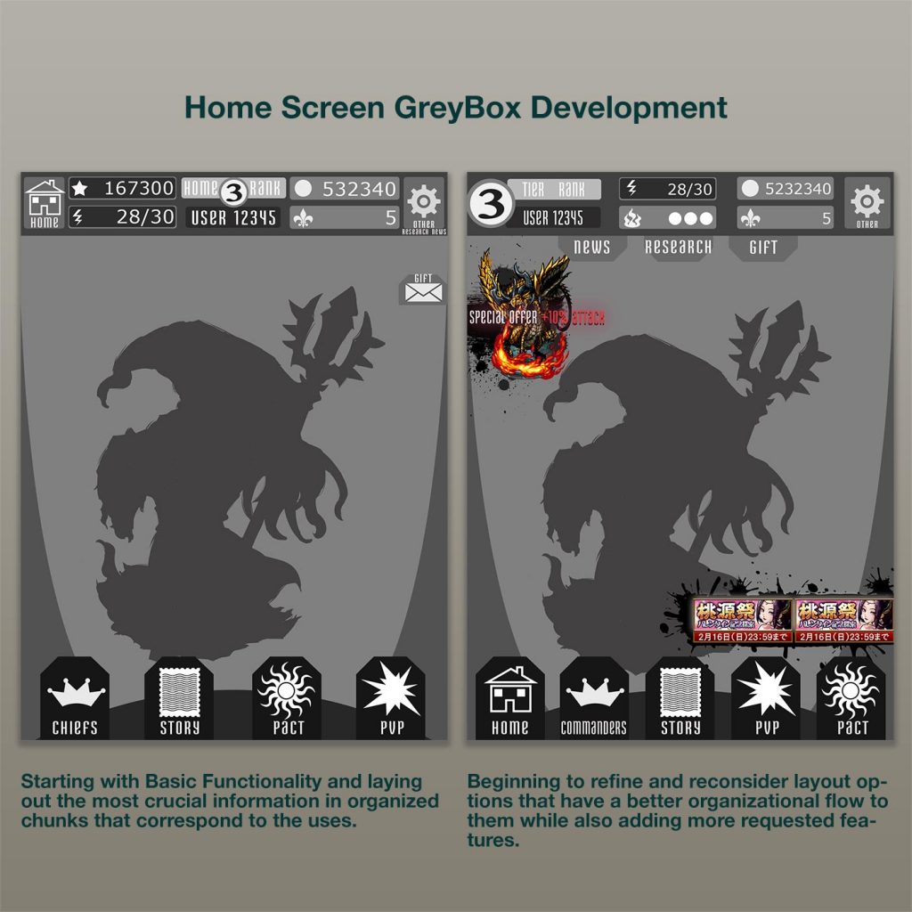
Because the app was meant to be expanded over time, it was very necessary to achieve a layout that would accommodate many possible additions and ideas that would come down the development pipeline post-launch. The layout as described was instrumental in enabling this expandability without compromising the look and feel of the visuals or overall UX design. Much of it is thanks to diligent and very thoughtful UX grey-boxing that was undertaken in order to functionally prototype the component layout and generate feedback from in-house user testing.
As with every screen in BB2, the Layout had to account for various Screen aspect ratios for Phone and Tablets. I was able to accomplish this through utilizing the Unity Canvas system whose options enabled UI Layouts with fixed Heights, so then the Engine would automatically adjust the layout widths of the components in each screen without compromising their visuals or throwing their scale factors off. Some visual artwork had to be drawn to accommodate the maximum horizontal width aspect ratio and the "thinner" screens would simple "cut off" the outer parts, though this was mitigated by having the artists avoid drawing any critical or key artwork in those outer edges.
Task
Design and Implement a expandable Main Home Screen containing mass amounts of critical information in an organized and intuitive layout
-
Skills
Unity 3D (NGUI, UGUI, VFX, Animation), Photoshop, Illustrator
-
Employer
DeNA